Remember the days of hyper-saturated photos that practically screamed “look at how vibrant these colors are!”? Well, step aside neon sunsets and turquoise oceans, because there’s a new trend in town – and it’s all about subtlety.
The world of design and photography is embracing lowered contrast, a technique that creates a more muted, sophisticated feel. But this isn’t just about a fad; it’s a shift towards a more intentional and evocative visual language.
Beyond Brightness: The Allure of Lowered Contrast
Remember those photos that looked like they exploded in a Skittles factory? Yeah, the ones where the blues were so impossibly blue they felt like they belonged in a cartoon? Well, step aside hyper-saturated everything, because there’s a new trend in town, and it’s all about subtlety. The world of design and photography is embracing lowered contrast, a technique that might sound a bit boring at first, but trust us, it’s anything but.
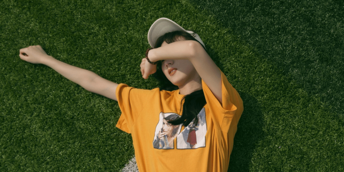
Instead of harsh contrasts and in-your-face colors, lowered contrast creates a calmer, dreamier feel to images. Think of it like the difference between staring straight into the midday sun and gazing up at a gentle twilight sky. The whole scene feels softer, more inviting, and a recent article in “F-Stop Magazine” even suggests it can spark emotions like nostalgia or quiet contemplation. They hit the nail on the head with that one. A lowered contrast photo can transport you to a specific memory, a simpler time, or simply allow you to relax and appreciate the image without feeling visually overwhelmed.
Imagine a portrait where the stark white background has been toned down a touch, and the deep shadows under the subject’s eyes are softened with a gentle gradient. Suddenly, the focus isn’t just on the person’s features, but on the emotions in their eyes, the texture of their skin, the story their face tells. That’s the power of lowered contrast – it invites you to linger in the image, to appreciate the details, and to connect with the scene on a deeper level. And that’s pretty darn cool for what might seem like a simple adjustment at first glance.
Beyond Photography: A Design Trend with Staying Power
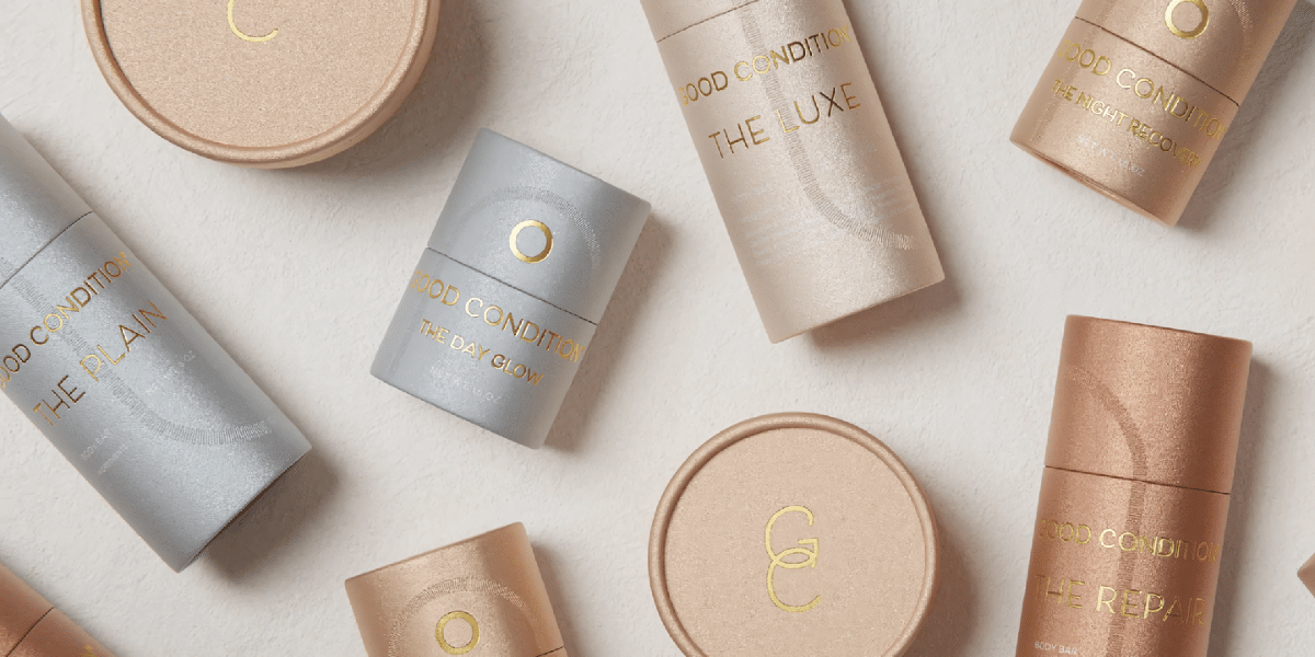
The lowered contrast movement isn’t just about making photographers squint at their screens less. Graphic designers are diving headfirst into this aesthetic too, opting for muted color palettes and subtle gradients in their work. Think of it as a departure from those loud, attention-grabbing websites that felt like they were yelling at you with a million colors. Lowered contrast brings a sense of sophistication and minimalism that can be a game-changer for branding and web design.
Imagine a website with a background the color of a calming cup of tea – a soft beige instead of a blinding white. The text itself isn’t a harsh black that seems to vibrate on the screen, but a deep charcoal gray that’s easy on the eyes. The overall effect? Calming, almost serene. It allows you to focus on the content, to navigate the site without feeling overwhelmed by a visual assault. It’s like the design equivalent of taking a deep breath and letting the information sink in.
There are a few reasons why lowered contrast is becoming so popular in graphic design:
- Readability First: Let’s face it, sometimes those super bright websites make it hard to actually read the text. Muted color palettes can significantly improve readability, especially for designs heavy on text. No more squinting at tiny paragraphs crammed onto a neon green background!
- Versatility is Key: The beauty of lowered contrast is that it can work for almost any brand. Think about it – from luxury fashion houses to tech startups, a muted color scheme can create a sense of sophistication and professionalism. It’s like a design chameleon, adapting to different styles while maintaining a timeless feel.
- A Timeless Appeal: Unlike some trendy design choices that fizzle out faster than a fad, lowered contrast focuses on classic combinations and avoids flashy color trends. This means your brand identity won’t look dated next season – it will exude a sense of enduring style and quality.
The design world is a constantly changing landscape, but lowered contrast seems to be here to stay. By embracing a more subtle and sophisticated aesthetic, designers can tell stories and evoke emotions in a way that feels timeless and impactful. So next time you’re scrolling through your feed, pay attention to the colors and tones you see. The era of blinding brightness might be fading, and a world of soft focus and muted elegance might just be taking its place.


